Belgian designer created new visual identity for “K-Totem” in Kaunas
2022-06-29
Belgian designer created new visual identity for “K-Totem” in Kaunas
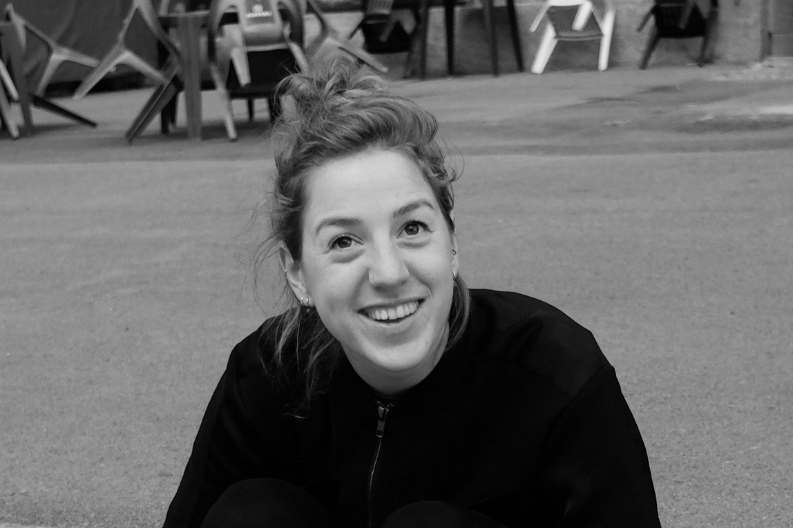
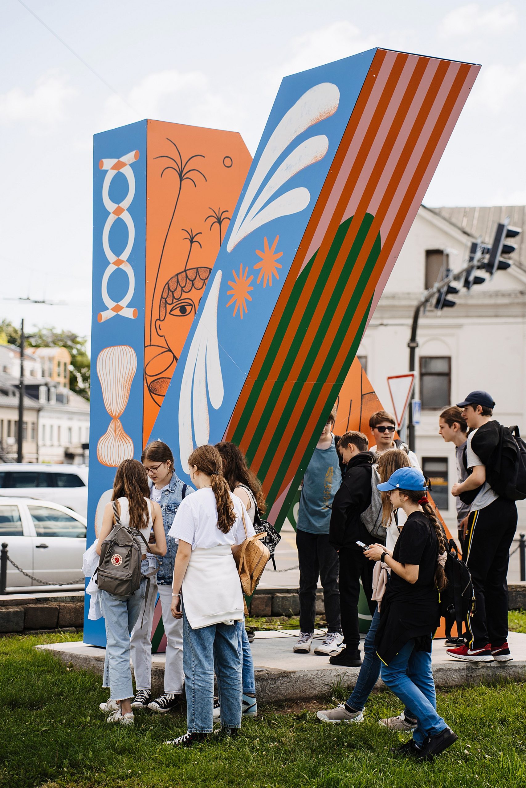
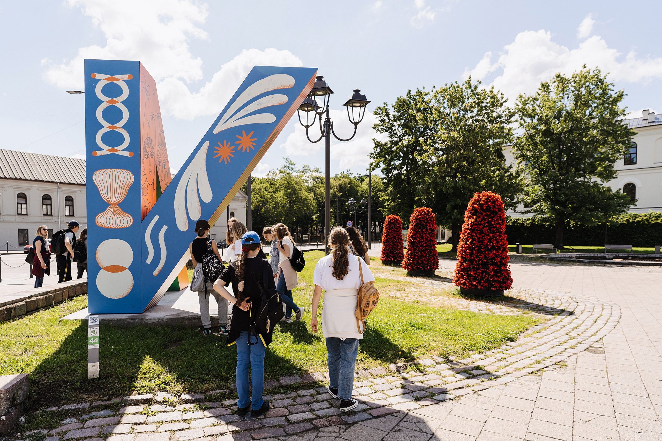
Kaunas has a new visual identity created by Elise Vandeplancke, a graphic designer from Kortrijk (Belgium)!
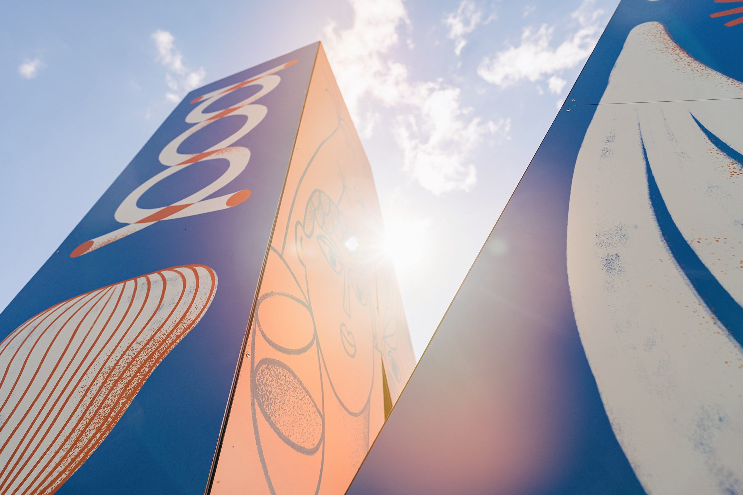
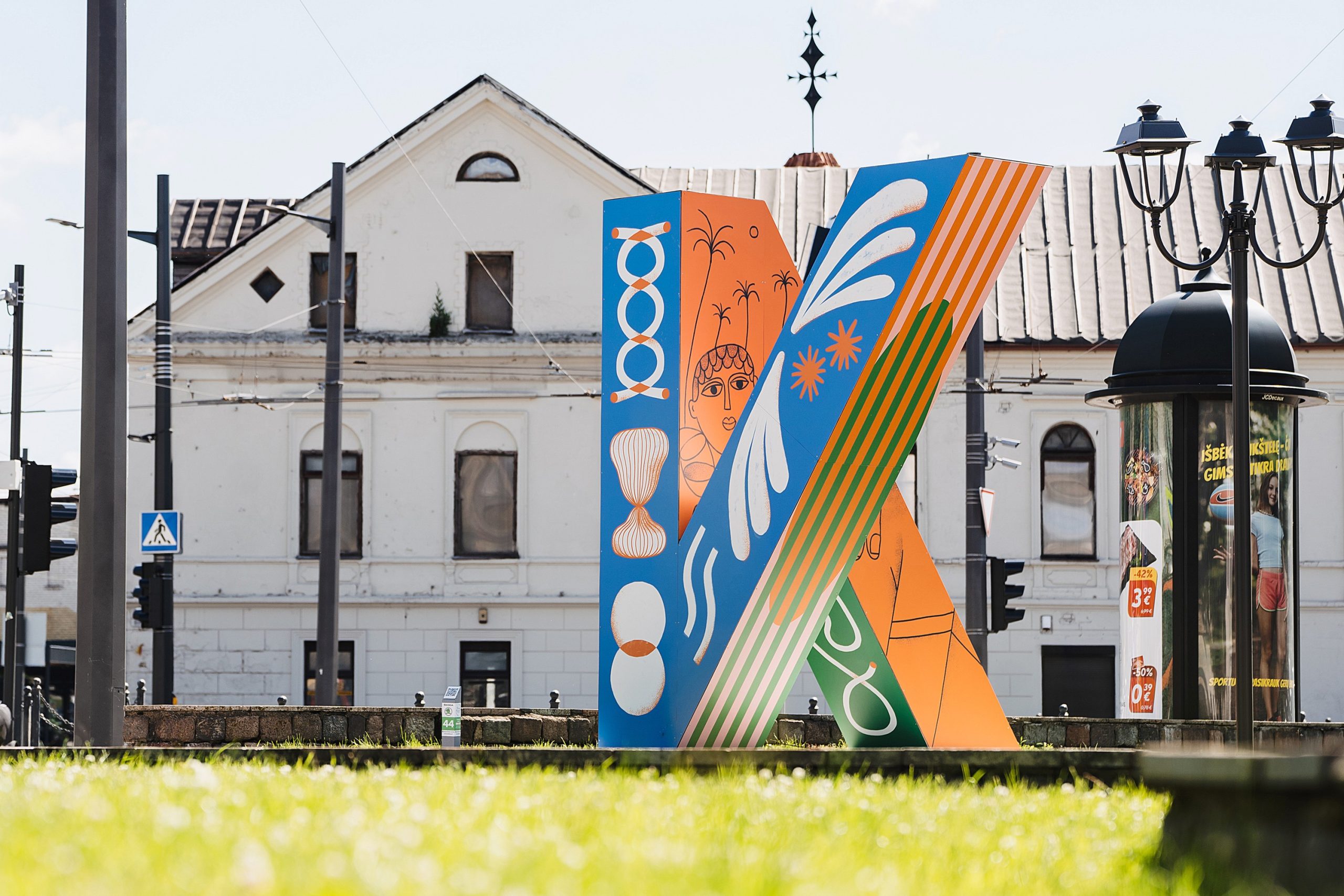
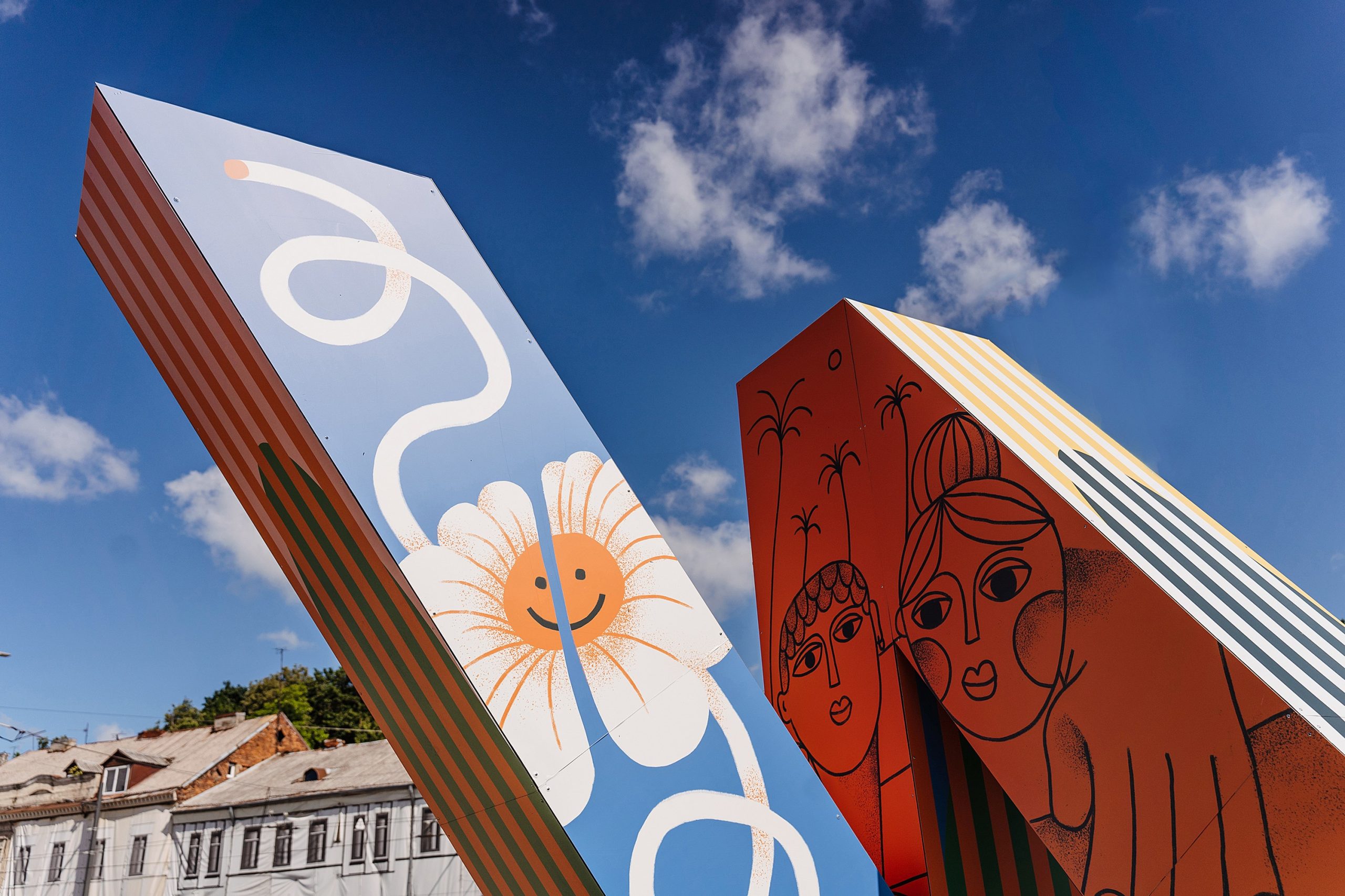
The work is dedicated to the friendship between the cities, which started several years ago between Kaunas and Kortrijk, and the “K-Totem” sculpture has become a perfect platform for various visual messages.
More recently, “K-Totem” in Kortrijk has been adorned with a visual sculpture created by Lithuanian designer Mantas Kuginis.
We invite you to get to know Elise better:
Elise, how would you introduce yourself to the Lithuanian people?
I am an illustrator living and working in Kortrijk, Belgium. I graduated in graphic design from Sint-Luc in Ghent in 2015. After a Master’s degree at the Belgian School of Advertising, I started my career as a graphic designer and since 2020 I have been working as a freelance illustrator and now I draw for newspapers, magazines, advertising, posters and packaging.
Can you tell us more about the design you created for K-totem? What is the message behind it? What story do you want to tell with it? Where did you get your inspiration from?
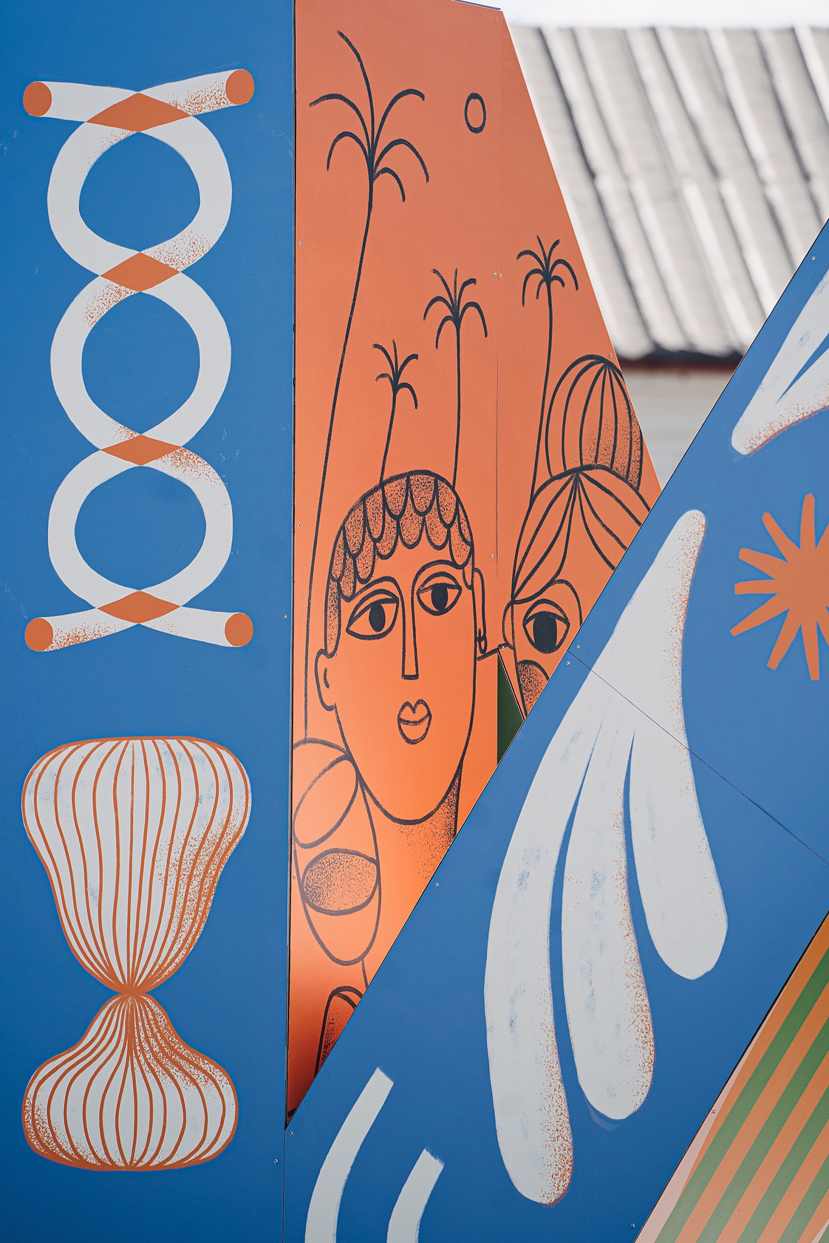
The main message is friendship – urban friendship between Kortrijk and Kaunas. This theme is a beautiful symbol that can be worked with very successfully. I would divide the visuals into 4 different designs, which vary from very clean graphic design to very direct and spontaneous illustration. I always try to find a mix within this spectrum when I’m designing – do I want to work in a graphic and rigorous way, or do I want to go for spontaneous illustration? K-totem was fun to work with because I had the opportunity to show different sides of my work. This way of working also allows me to reach out to a lot of different people, as everyone is looking for different things in their work.
A little bit about the design elements:
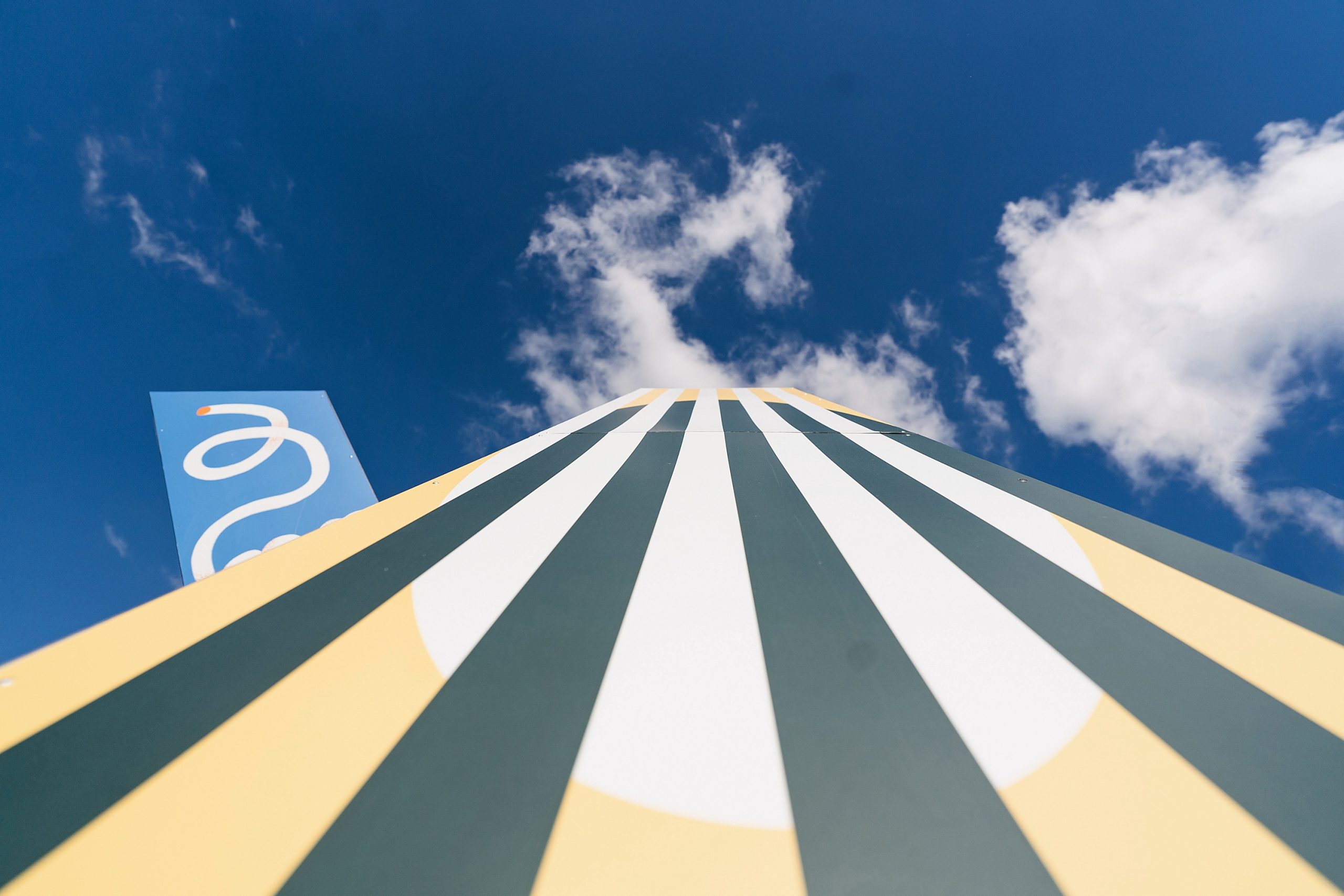
The strips: the strips are on two different sides and come together in the middle to form a unique shape. This unique shape symbolizes the collaboration between two cities.
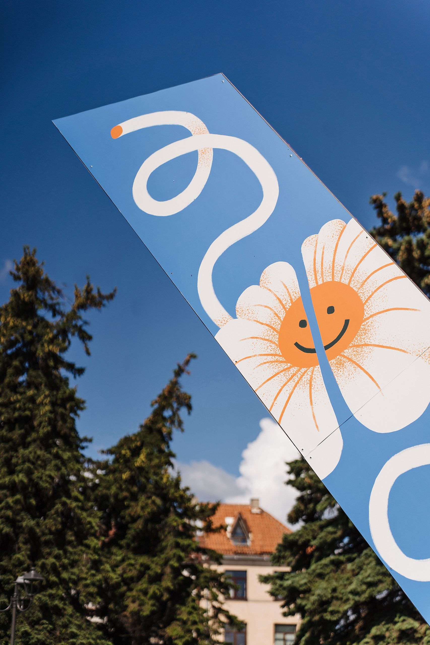
Flowers: the flowers grow from different places and merge (the merger symbolizes the friendship between the cities). Although the flowers merge at the top to form a beautiful whole, they also exist separately.
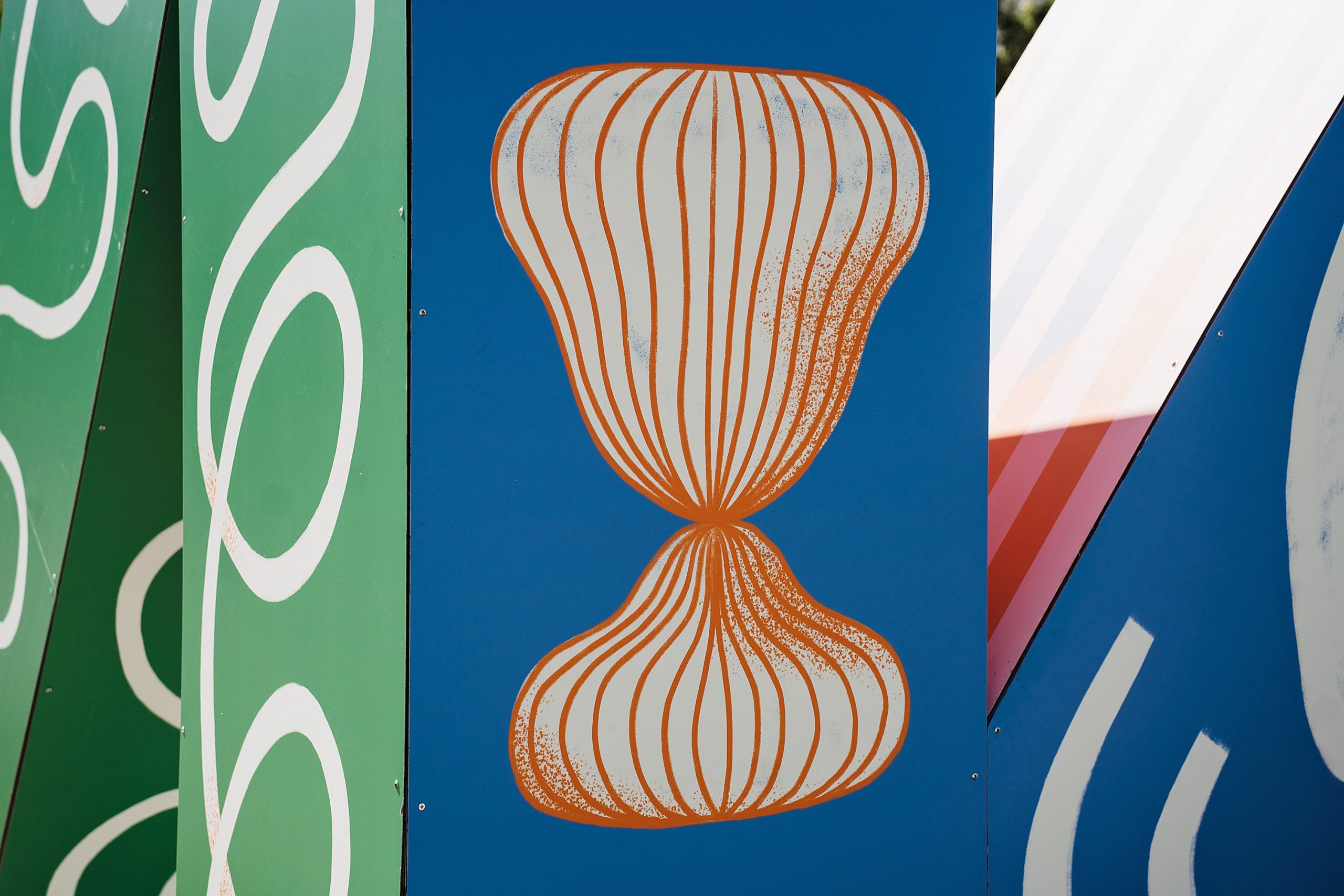
Abstract shapes: two shapes that are slightly different from each other and complement each other. The shapes look good on their own but are even more beautiful when seen together.
Two people hugging: this is a very direct illustrative form representing friendship.
How do you think your K Totem visual will make people feel?
The “K-Totem” sculpture is placed in a public space and will be visible to many different people in their daily lives. I tried to create an accessible design with lots of color to reach as many different people as possible. I want to brighten up their day and bring at least a small smile.
Is the K Totem sculpture a good tool for a designer to broadcast his message, to reveal his thoughts?
“K-Totem” is not an easy medium, because it looks different from every side. I usually create drawings that can only be seen from one side, like a print on a piece of paper or an image on a computer. The different sides of the K-Totem make it very challenging but also interesting.
It was very important to me that the design looks good not only from a distance when you pass it by in a car or on a bike, but also when you get closer. That’s why I had to find the perfect harmony between the details of the piece.
How long have you been designing? What projects do you usually work on?
I created the invitation for my communion party when I was 12 years old, and from the age of 15 I started designing baby announcements and posters for parties. At the age of 23 I started working as a graphic designer, designing for cultural events in Bruges. I have also always designed for friends and family, mainly posters, logos, corporate identity or websites. I started drawing on the train on my way to work, and when I started posting my work on Instagram, I started getting more and more commissions from companies. Two years ago, I left my corporate job and now work as a freelance illustrator, mostly creating illustrations for national and international newspapers, magazines and blogs. I also do packaging design, posters and animation.
What has been the most ambitious or challenging project you have worked on in the past? Is that the project you are most proud of?
It’s hard to say. I usually find it harder to design something for friends than for companies. I’m very proud of working for newspapers like the Belgian newspaper De Morgen or the Dutch newspaper De Volkskrant. But I am equally proud of the design work I have done over the years for our local skatepark, Jansan. I was also recently commissioned to create illustrations for Meta to be used in the Facebook Messenger app. I try to treat all projects the same, whether it’s a non-profit organization or a large multinational company. This summer I am also organizing a zine and illustration festival in Kortrijk, a project I am also very proud of.
Where do you see yourself in five years?
In recent years I have started to paint, I am looking for ways to combine my illustrations with painting. I really believe that I will be able to achieve a lot in this field. I would also like to create animations for music videos in the future.
Thank you!
The “K-Totem” sculpture was created by 15 companies, design agencies and research institutions based in Kortrijk, Belgium. “Designregio Kortrijk” in Kortrijk produced the new “K-Totem” structure and brought it to Kaunas in autumn 2021. The three-dimensional sculpture is located in the center of Kaunas, in the Founding Seimas Square. The visual design of the spatial sculpture has already been created and will be created by local and foreign creators, and the visual content is planned to be updated 2-3 times a year, giving the creators the opportunity to present their work to the public.
